Hi there! I’m Matthew, Harvest’s new visual designer, having joined the team here in October. So far I’ve been responsible for the new look of this main website and blog, recent ad campaigns, and now I’m onto updating the look and feel of Harvest. I’d like to explain what changes we’ve made today, and what these changes mean for you.
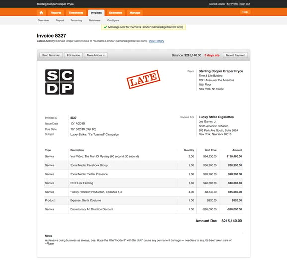
We’ve nicknamed this layout update Harvest HD. While we know it’s not quite 16:9, this new design brings a wider HD feel to the application. We’ve removed the borders around the main content area and pushed the page out to your full browser width. Before HD, Harvest had a minimum width of 840px, and HD takes us out to 980px.
In addition to widening every section of Harvest, we’ve brought in a modified version of a 16-column Blueprint Grid. We’ve brought the Invoices and Estimates pages into this grid already. As we move forward, we’ll be using the extra room and this unified grid to make better usability choices.
New Invoices and Estimates Pages
Highlights of these new pages include:
- Using CSS3 for the buttons and toolbar.
- Grouping all action buttons together.
- Bringing the Web Invoice/Estimate design into the app, so that you see what your client sees.
- An easier way to see if an estimate is accepted or declined.
- An invoice and estimate header that includes the most recent action and a link to the Invoice History.
- A cleaned up Invoice History log that is easier to scan.
Building A Better Button with CSS3
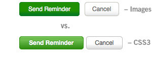
 One of the biggest changes in Harvest HD is our push for CSS3. With CSS3, we are able to create smooth gradients, rounded corners, and drop shadows without the use of images. This significantly cuts down on our HTTP requests (ie. page load time). The navigation is also now done in CSS3, though it looks strikingly the same, with the Home icon remaining the only image. We’re excited to start bringing these buttons and techniques to the rest of the app.

A Word for Internet Explorer Users
Internet Explorer users may notice that the image above does not match the navigation they’re seeing in their Harvest Account. This is because Internet Explorer 7 and 8 do not support many of the modern techniques available in other browsers. While there are methods available to bring rounded corners and shadows into Internet Explorer, many of them impact load and render speeds by loading extra files or downloading additional images. Harvest continues to support IE 7/8 by making sure that any advanced techniques we employ degrade gracefully and work without changing your workflow. We’re hopeful that the next version of Internet Explorer (IE9) will be released soon, as it brings with it improved CSS3 support.
Leaner and Faster
In addition to the CSS3 changes, HD helps us work toward our goal of making Harvest leaner and faster. Improvements in this latest release will allow us to shrink the size of our CSS and Javascript packages, and we’ve gotten a little smarter about our asset caching. While these improvements won’t change the way Harvest works for you, we hope you’ll notice that Harvest has a little extra pep in its step.
This update has been a long time coming, and we’re excited about today’s launch. Though the largest impact can be felt in Invoices and Estimates, Harvest HD gives us a strong foundation for future improvements to all areas of our application. Take a spin through your Harvest account to see how this wider, roomier view feels, and enjoy!
